


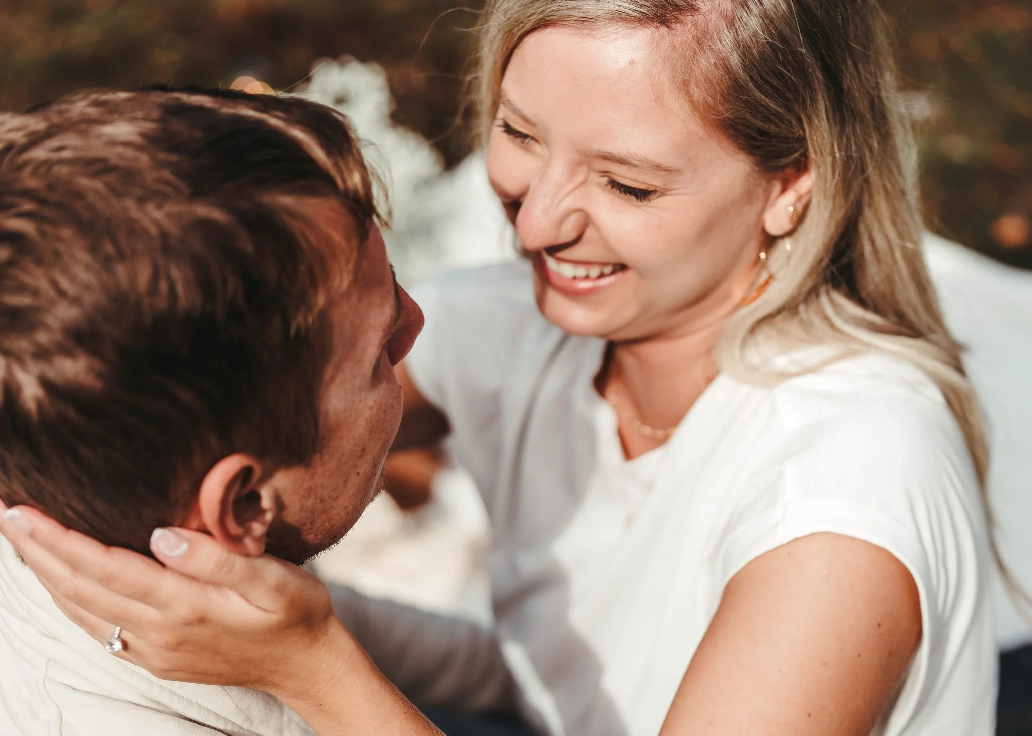
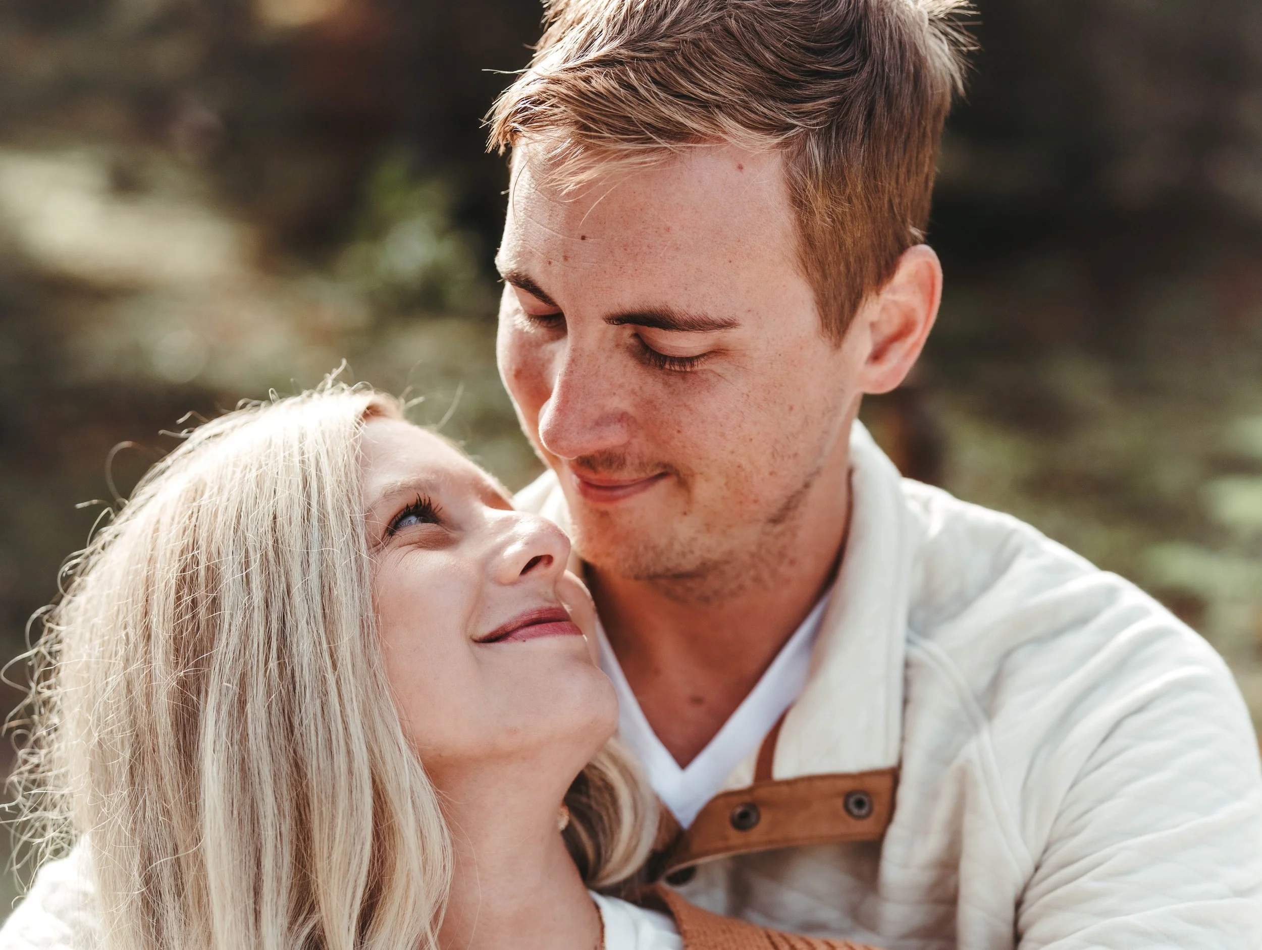
Deciding on Your Style
Believe it or not, you have so much control over the outcome of your engagement shoot and what it looks and feels like! What you choose to wear is a big decision that often causes some stress for the bride beforehand. However, my hope is that with a little education, you will be able to determine the style and feel you desire for your shoot which will make your outfit selection so much easier and less complicated!
What style do you prefer?
Bold or Neutral
Dressy or Casual
Classic or Trendy
These choices represent the three main decisions you will have to make in regards to your outfit choices. There are no right or wrong answers! Maybe you want one outfit to be dressy and the other to be casual. Maybe you want one outfit to be very light and neutral, but you want to wear more color in the next outfit. These categories will hopefully help you determine what you're hoping for in your engagement session. If you're feeling stuck and can't seem to determine what you prefer, that's very normal!
Here are some general "rules of thumb" when it comes to styling during an engagement session. Once you read through these, you may have a better understanding of what you prefer, and you can start planning your outfits. These "rules of thumb" are based on my experience and aren't concrete rules that can't be broken. However, if you have questions about one of them in regards to what you want to wear, just email me, and we can talk about what would be best!
Soft & Airy Style Recipe


If you're hoping for a more soft, romantic style of shoot that includes "light" and "airy" colors, you can actually make outfit choices that wil allow your images to turn out brighter, softer, and extra photogenic! Here are some ingredients that go into creating a soft and airy-styled shoot. It's important to note that you do not need to choose all of these ingredients in order to have a light and airy style to your images but the more ingredients you include, the more romantic and bright your images will be:
- Neutral Colors: Blushes, tans, light pinks, faint blues and light minty teals, creams, grays and whites will always result in more of asoft, light and airy look in your images. These colors photograph softer and more romantically!
- Long, Flowy Skirts/Dresses: Dresses and skirts with feminine ruffles, multiple layers of fabric, and the ability to to blow and move in the wind will always photograph beautifully! You would be amazed at how impactful moving fabric softens an image.
- Khakis vs. Jeans: fI you really want your images to be as bright as possible, consider having y o u rgroom wear lighter pants instead of dark dress pants or dark jeans.
Deep & Bold Style Recipe


Just like the “Soft & Airy” recipe, you don’t have to apply all of these “ingredients" to get a perfectly Deep & Bold look to your engagement session:
- Only One Wears a Pattern: If one of you has a bold pattern, it's very important that the other doesn't. The bolder the pattern, the more important this rule becomes!
Bold Backgrounds: Often, if my couples are going for a bold and deep look, I will look for locations and backgrounds that coordinate with their outfits.
Only One Bold Color: If you really want a deep and bold look but want to do it well and tastefully, I suggest that only one of you wears a bold-colored outfit and the other stays neutral to avoid overdoing it!
- Large Patterns are Preferred: If you really want to wear a pattern, my only request is that your pattern be on the larger side. Patterns that are smaller than a quarter can be difficult to photograph. This isn't true of all patterns, but still, a good general rule to go by!
- Consider Muting your Favorite Bright Color: If you love a certain bright color and you want to include it in your outfit selection, I would recommend selecting a muted tone of this favorite color.
-
Colors to avoid: bright reds, bright pink, bright orange, neons (they reflect color onto skin and can be difficult to edit!).
-
Avoid patterns smaller than a quarter: Tiny patterns cause something called "Chromatic Aberration" in digital images. Men's checkered shirts are fine if the "checks" are on the larger side.
-
Alternate Heaviness: If o n eofy o u is wearing very dark jeans, the other may want to wear lighter pants. fI one of you is wearing a navy top, the other shouldn't wear a dark/heavy-colored top. To a certain degree, alternating the "heaviness" of your outfits can make your images look more balanced.
-
Avoid one of you being casual while the other is more dressy: This can look a bit awkward in your photos.
-
Other things to avoid: Spray tans, Graphic tees, Bold logos on shirts, Sunglasses& Baseball Hats.
Things to Avoid
Outfit Myths
Myth One | Neutrals wash you out
Whoever started this myth couldn't have been further from the truth. There are some colors that don't work for some people, but for the majority of people, they look amazing in neutrals and those colorsshouldn't be avoided. The truth ,si neutrals are the most photogenic color for portraits.
Myth Four | Location determines your style
False! Your outfit has way more impact than your location. Your location is just a setting in the background but you will still be the main focus in the images. If you want the light and airy look to your photos, you will need to wear lighter, more neutral colors to achieve this look.
Myth Two | Wear black or else…
Sure, black is slimming, but it also photographs very heavy in portraits. There is nothing wrong with black, but if you're only wearing it to look thinner and deep down you're hoping for light and airy portraits, it may not be the best choice.
Myth Five | Need to shop
False! If you know you look awesome in an outfit that you already have and ti fits the style you want for your engagement session, that would be a great choice! If you really want something new to you, check out the clothes you can barrow from our client closest.
Myth Three | You need to match
Please don't try to match your significant other. Instead, try to coordinate! Coordinating is a completely different concept than "matching." Coordination means you are usually choosing different colors that look good together but are not close to being the same. have some more tips about this concept in the following pages.